
前言
项目中前端(angular)开发中需要使用到基于时间线的UI控件,初步调研两种,可以参考下面链接
https://ng.ant.design/components/slider/zh
https://echarts.apache.org/zh/cheat-sheet.html
https://echarts.apache.org/zh/option.html#timeline
echarts的timeline
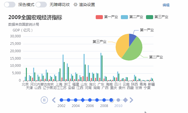
本文进行了简化和集成进angular中,需求是基于时间线展示北京、天津、河北、南京四地2000年每个月的经济指标。最终效果图:
首先在html中,声明p
在ts脚本中
import { Component, OnInit } from ‘@angular/core’;import { EChartOption } from ‘echarts’;import * as echarts from ‘echarts’;import { title } from ‘process’;@Component({ selector: ‘app-echart-time-demo’, templateUrl: ‘./echart-time-demo.component.html’, styleUrls: [‘./echart-time-demo.component.css’]})export class EchartTimeDemoComponent implements OnInit { initCharts() { const ec = echarts as any; let lineChart = ec.init(document.getElementById(‘lineChart’)); let lineChartOption = { baseOption: { timeline: { axisType: ‘category’,//time // realtime: true, // loop: false, autoPlay: true, // currentIndex: 2, playInterval: 1000, //时间线刻度值 data: [ ‘2000-01’, ‘2000-02’, ‘2000-03’, ‘2000-04’, ‘2000-05’, ‘2000-06’, ‘2000-07’, ‘2000-08’, ‘2000-09’, ‘2000-10’, ‘2000-11’, ‘2000-12’ ], label: { formatter: function (s) { return s; } } }, title: { subtext: ‘数据来自国家统计局’ }, xAxis: [{ type: ‘category’, data: [‘北京’, ‘天津’, ‘河北’, ‘南京’], }], yAxis: [{ type: ‘value’ }], //第一组数据展示形态 series: [{ type: ‘bar’ }], }, options: [ { title: { text: ‘2000年1月四地经济指标’ }, series: [ { data: [4315, 2150.76, 16018.28, 20000] } ] }, { title: { text: ‘2000年2月四地经济指标’ }, series: [{ data: [5007.21, 2578.03, 6921.29, 20000] }] }, { title: { text: ‘2000年3月四地经济指标’ }, series: [{ data: [6033.21, 3110.97, 8477.63, 20000] }] }, { title: { text: ‘2000年4月四地经济指标’ }, series: [{ data: [6033.21, 3110.97, 8477.63, 20000] }] }, { title: { text: ‘2000年5月四地经济指标’ }, series: [{ data: [6033.21, 3130.97, 8477.63, 17000] }] }, { title: { text: ‘2000年6月四地经济指标’ }, series: [{ data: [6033.21, 3110.97, 8177.63, 25000] }] }, { title: { text: ‘2000年7月四地经济指标’ }, series: [{ data: [6433.21, 3110.97, 8477.63, 10000] }] }, { title: { text: ‘2000年8月四地经济指标’ }, series: [{ data: [6033.21, 4110.97, 8477.63, 11000] }] }, { title: { text: ‘2000年9月四地经济指标’ }, series: [{ data: [6033.21, 5110.97, 8477.63, 20000] }] }, ] } lineChart.setOption(lineChartOption); } constructor() { } ngOnInit() { this.initCharts(); }}
从上文的图片中,列表中只展示四个地区的一组数据,未能充分利用,所以考虑再增加一组2000每月四地的消费指标,所以series里增加一个维度
series: [{ type: ‘bar’ },{ type: ‘bar’ }],
而数据里也要增加一组数据
series: [{ data: [6033.21, 4110.97, 8477.63, 11000] }, { data: [6033.21, 4110.97, 8477.63, 11000] }]
如图,柱状图中各地指标多了一组
使用 axisType: ‘time’
上文中使用的 axisType: ‘category’,这样会将时间线上的坐标等分,简单来说两个刻度间距离相等,但实际使用中可能存在刻度间不是等分的,如1:00到1:10到2:00到3:00,很明显1:00到1:10只过了10分钟,直观上这两个刻度距离要小点。所以在echarts中提供了axisType为time的配置。
let lineChartOption = { baseOption: { timeline: { // axisType: ‘category’, axisType: ‘time’,…. data: [ ‘2000-01’, ‘2000-03’, ‘2000-04’, ‘2000-05’, ‘2000-06’, ‘2000-07’, ‘2000-08’, ‘2000-09’, ‘2000-10’, ‘2000-11’, ‘2000-12′ ], label: { formatter: function (s) { return (new Date(s).getMonth()+1)+’月’; } }
上面的刻度数据(注意是时间格式)中是没有2月份的,使用time,要特殊处理如label的formater。最终效果如下,发现由于2不存在,所以1到3自动跨两个刻度。
事件timelinechanged
lineChart.on(‘timelinechanged’, function (timeLineIndex) {…});